Alice In Labyrinth Restaurant Rebrand
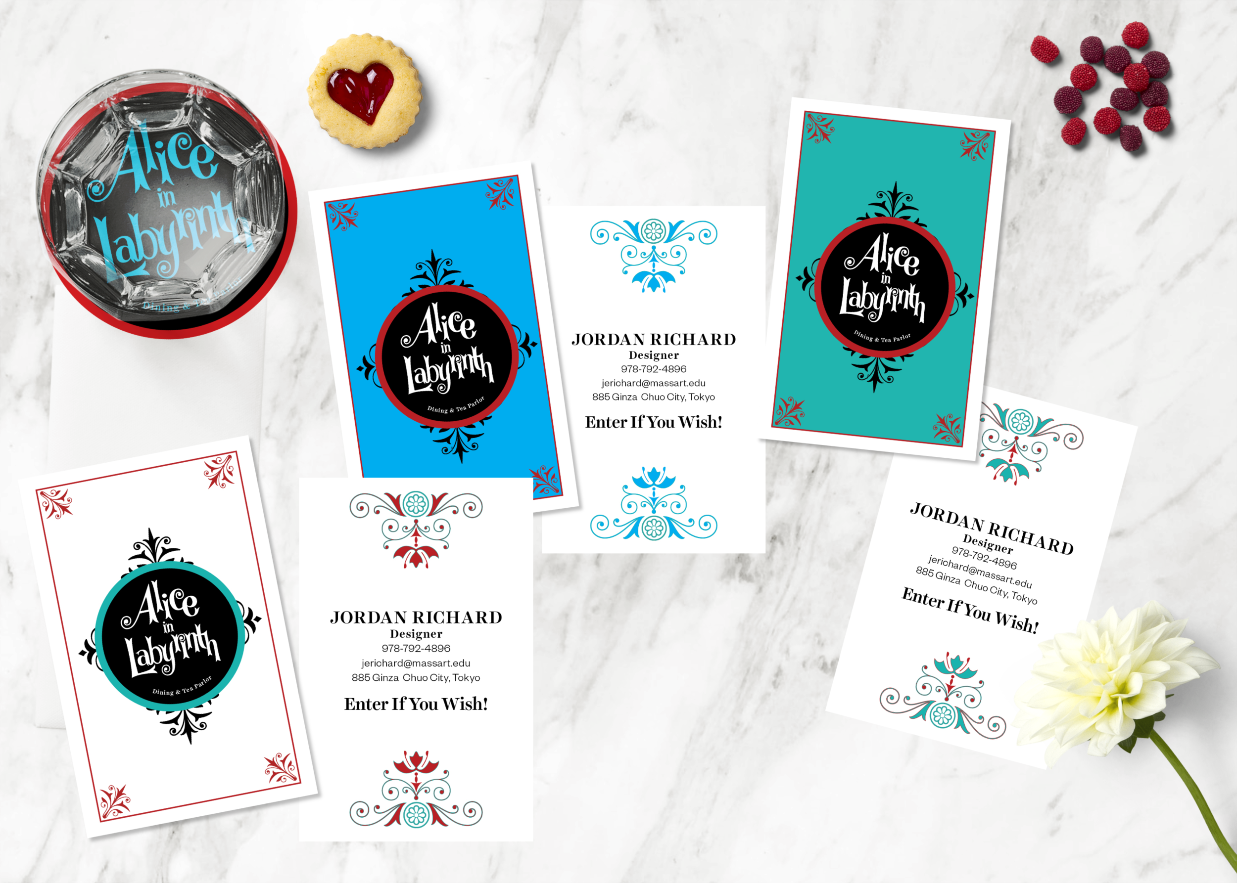
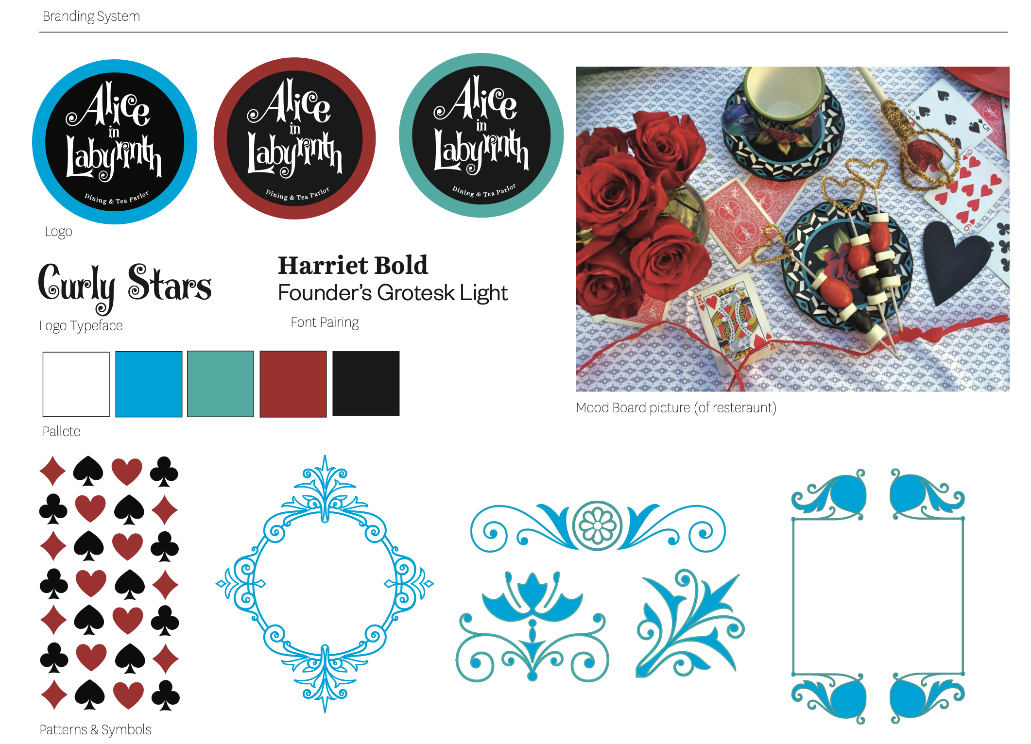
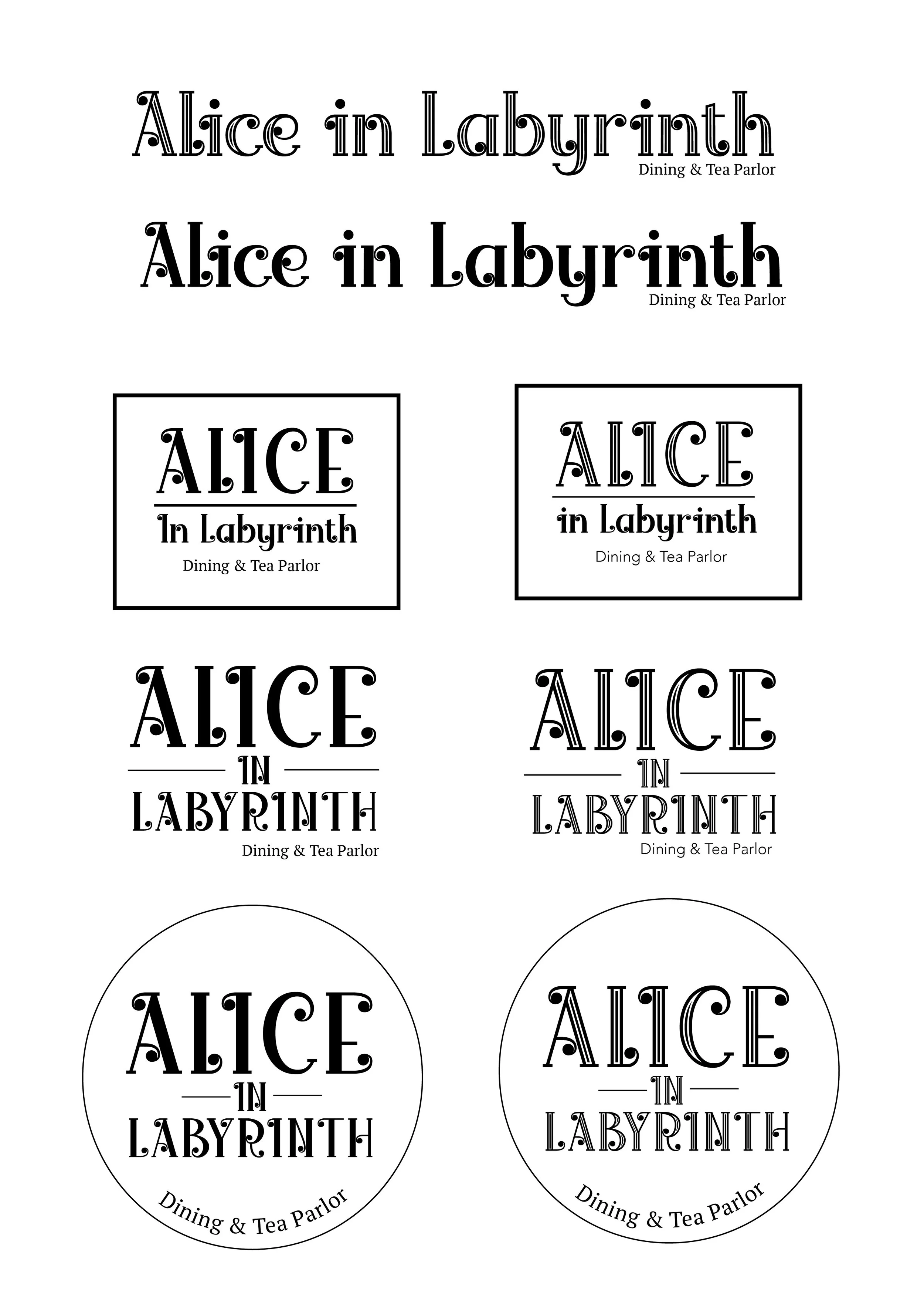
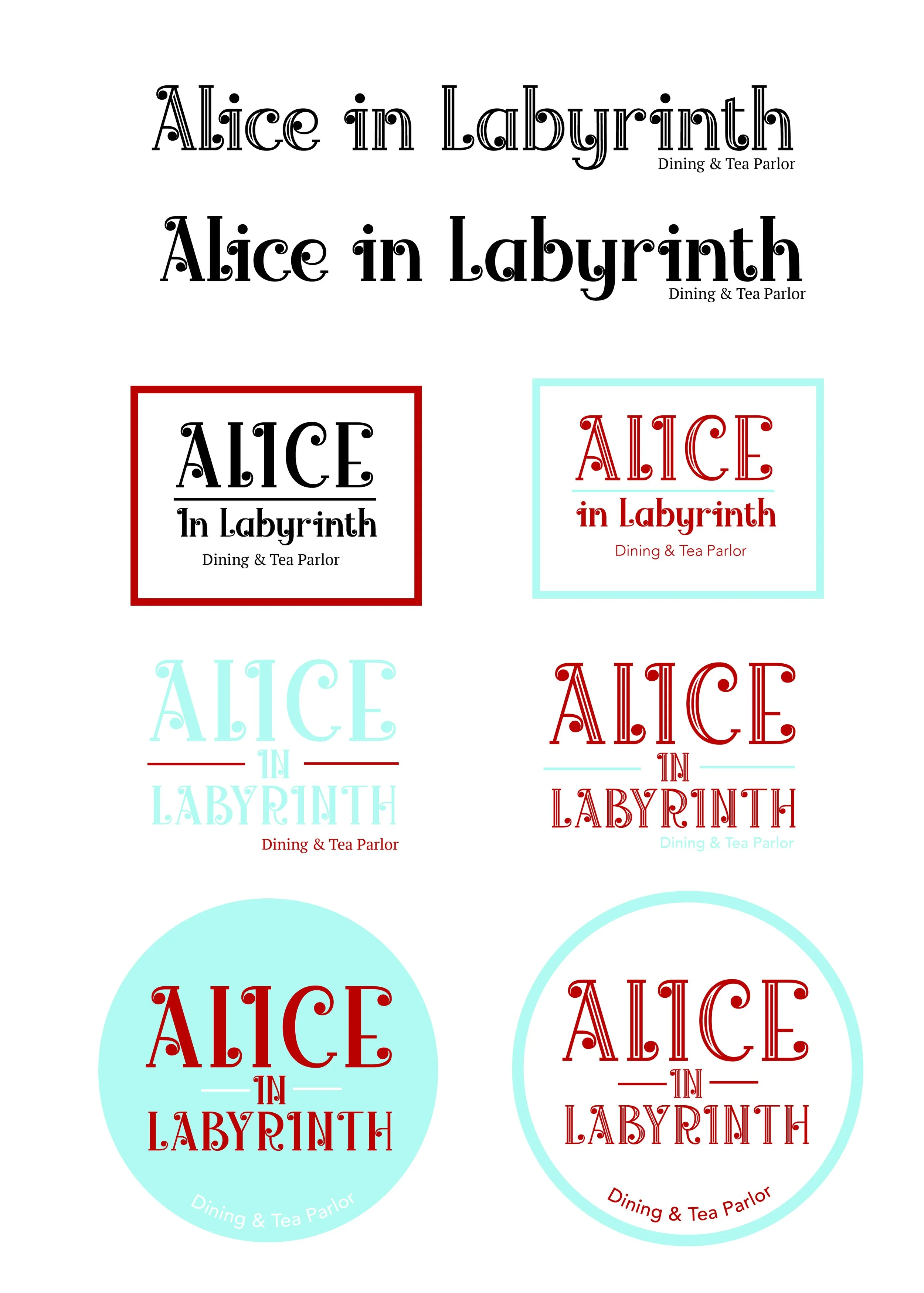
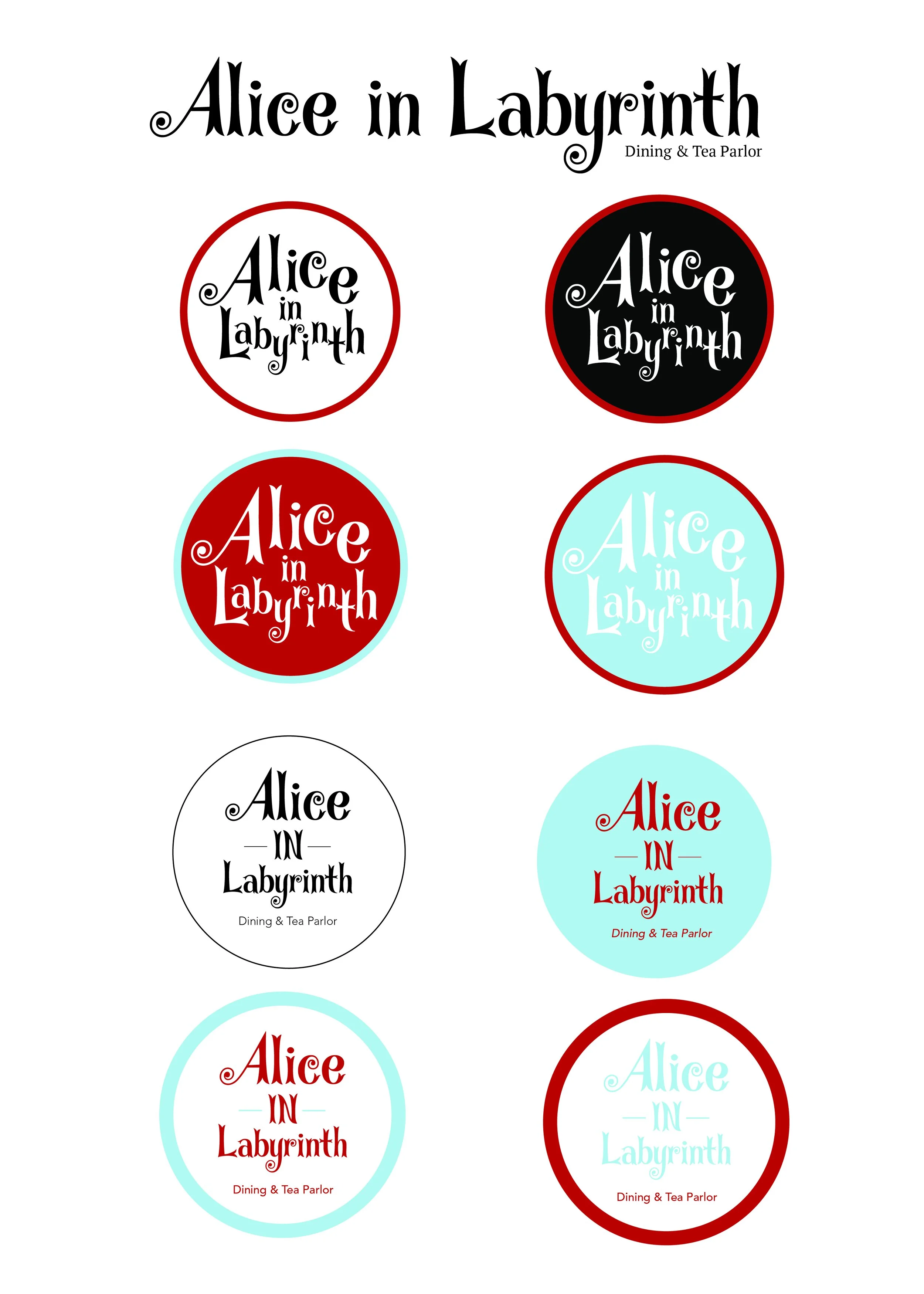
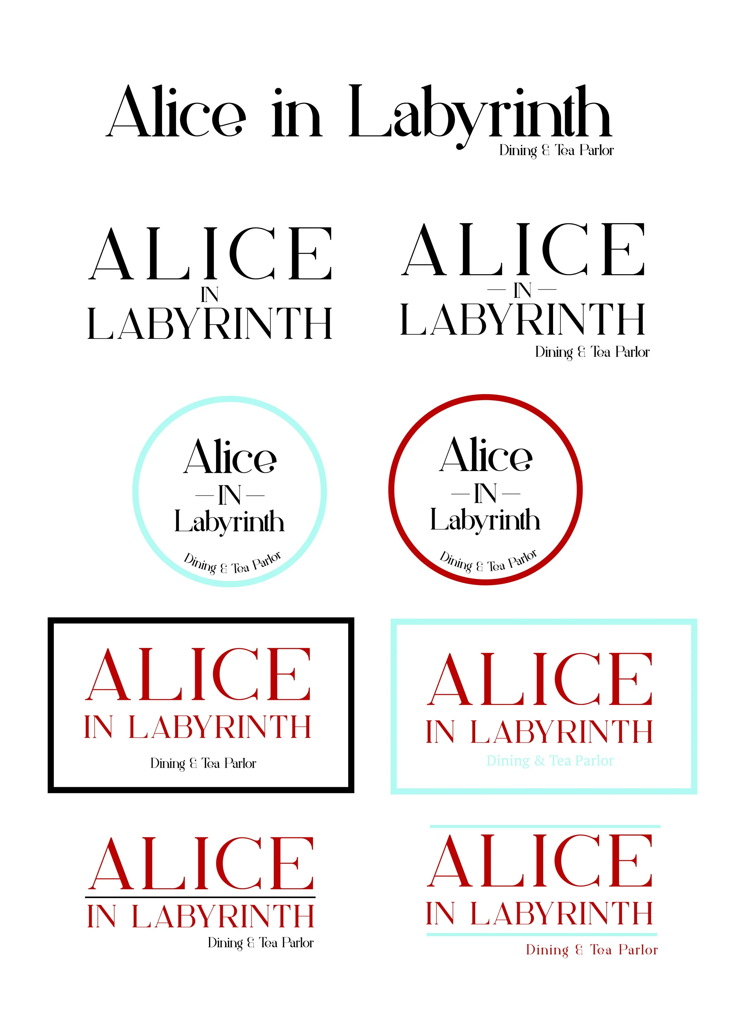
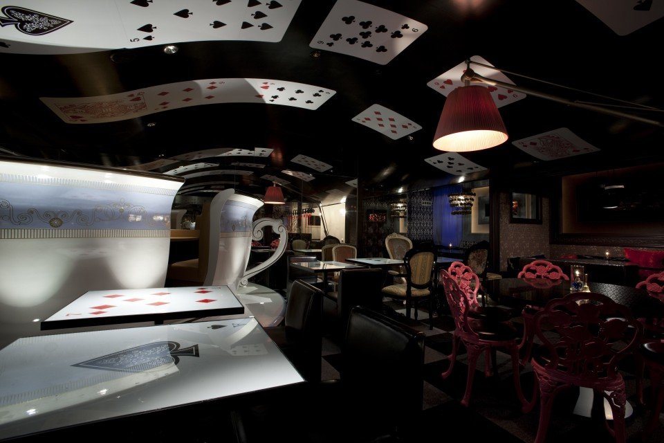
Alice in Labyrinth is a rebranding project derived from a restaurant located in Tokyo, Japan that consumes its guests in its elaborate theme of Wonderland. Like a labyrinth, guests must make their way through a maze that's walls are covered in Lewis Carroll’s writings of both Alice tales. For me, tying together the over the top motifs and the dining experience itself in a more constrained yet still playful way seemed like the best approach in narrowing a visual language throughout the brand. Adopting the card symbolism as well as visual elements that relate to the ornamental shapes on the backs gave way to a color palette most definitely involving the deck’s standard colors of black, red and white. To avoid the system being too dark or gothic, alice blue as well as the compliment of the red which reads as a green teal is additionally implemented to create a five color branding palette that serves flexibly in the supporting elements. The logo is typographically based with an edited version of Curly Stars to be more tight fitting with letters appearing jumbled as if they had just fallen down the rabbit hole!
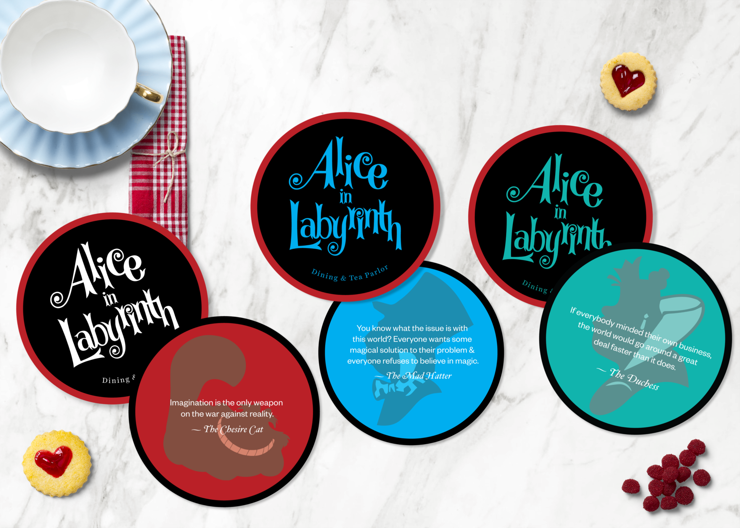
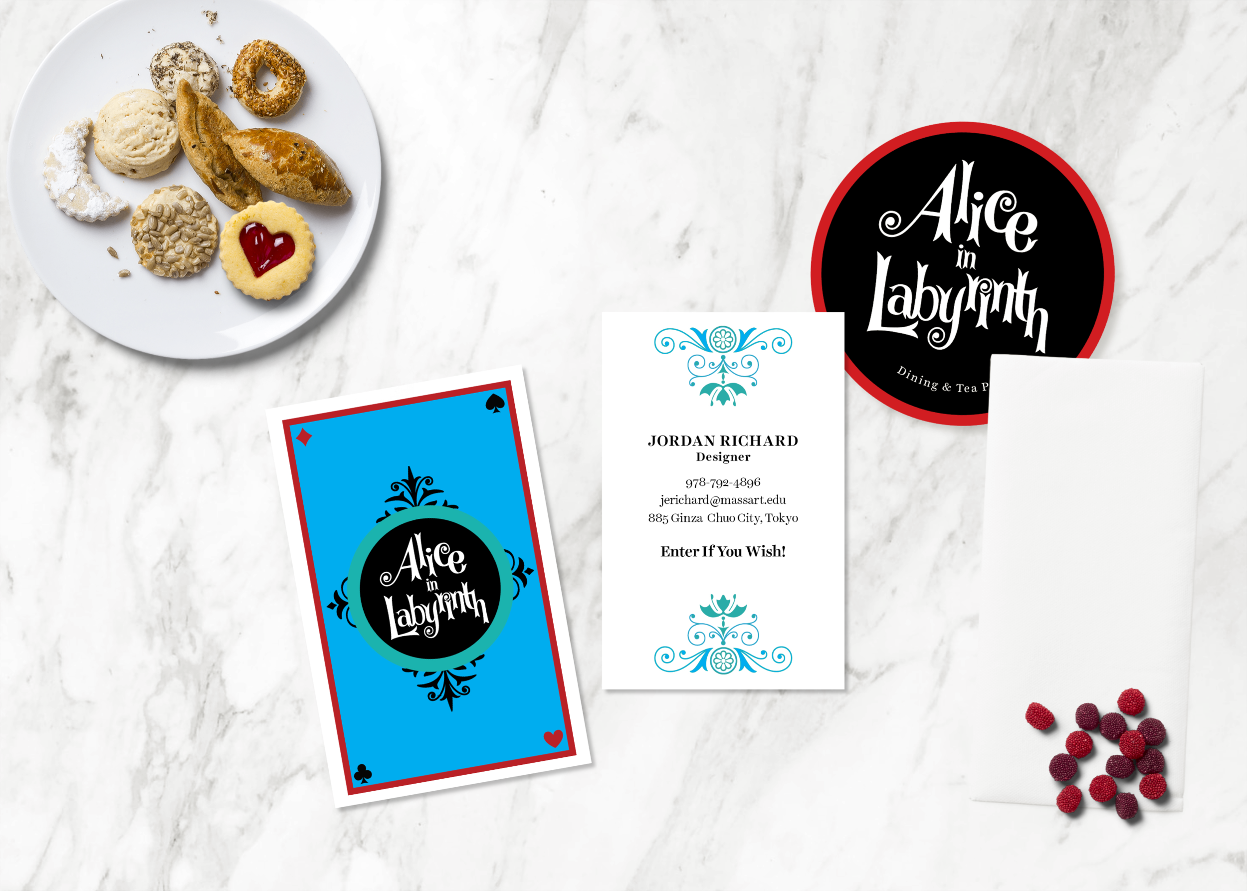
The rebrand showcases a new dinner menu, a drink and dessert menu(5x7), coasters (3.5x3.5) with quotes from the book on the back as well as a business card. In this process, I learned less can be more. The world of wonderland is too grand to incorporate all of its aspects within these specific print pieces in a concise manner, but when the elements are divided into their own relationships a nuance occurs.
Creating a system out of Chaos!
As mentioned above, the theme of Alice in Wonderland can be a bit overwhelming; especially to encompass all elements into one confined branding system.
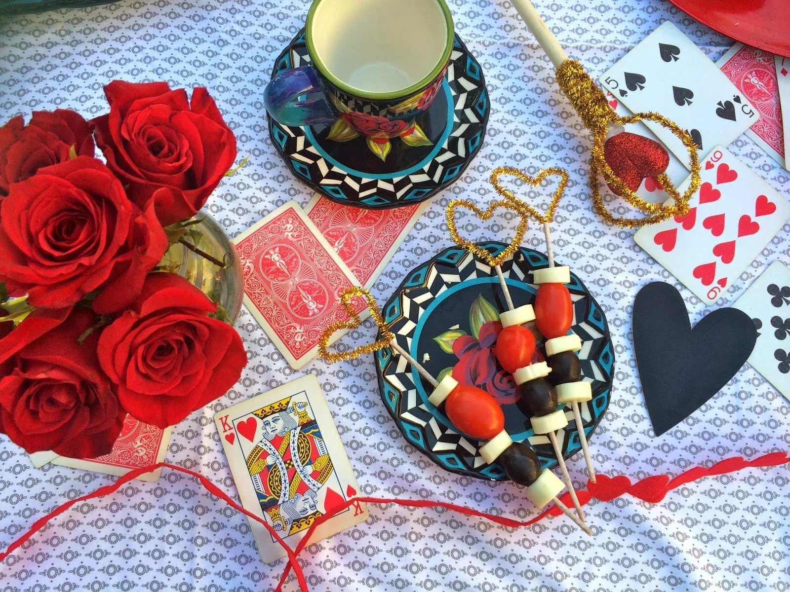
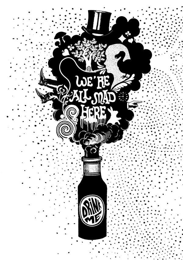
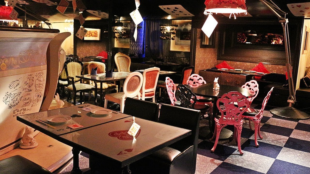
Mood Board Inspiration
& Location Images







The Final Turn Out
Below are images of the end result of the logo as well as other design elements that contributed to the rebranding process.
